
Designing for Brazil and Spanish-Speaking Markets: UX Localization Checklist
Table of Contents
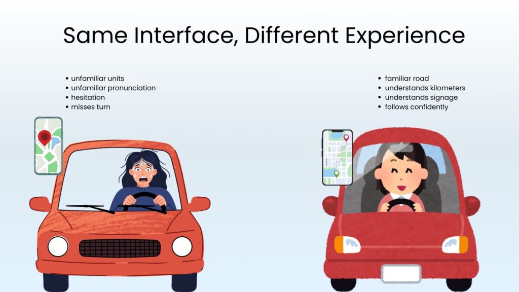
You land in Brazil for the first time. You pick up a rental car, plug your hotel’s address into the GPS, and start driving. Everything is in English.
Perfect.
A few minutes later, the GPS asks you to take the third exit at a roundabout.
The problem:
- The distances are in kilometers, not miles.
- The street names sound unfamiliar when they’re read aloud.
- Traffic seems to move differently.
You hesitate for a second, and even after following the GPS, you miss your turn. And now you automatically rely less on the GPS and more on your instincts.
So did the GPS fail? Technically No. Every feature worked exactly as it was supposed to. The problem was that it simply wasn’t designed for the way you experience the road.
That’s exactly what happens when businesses expand into a new market.
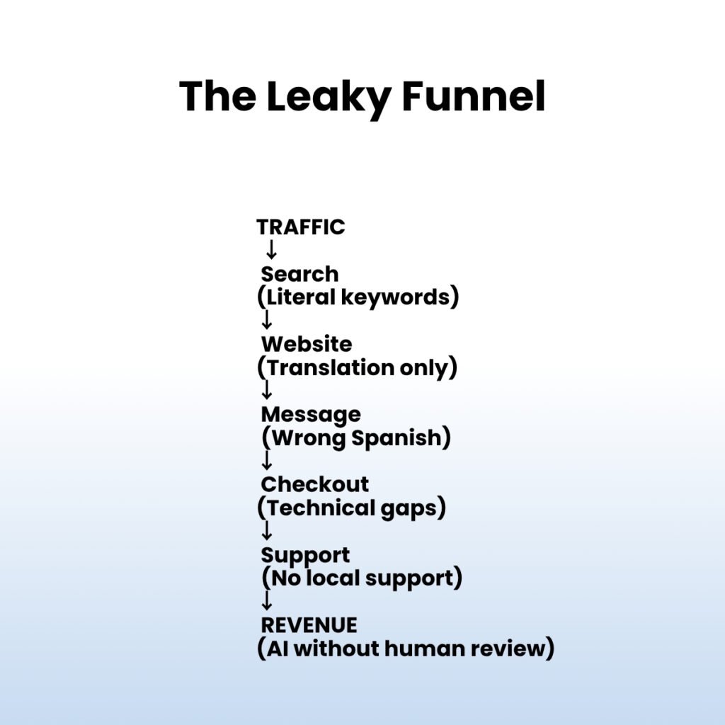
- The website is translated.
- The buttons work.
- The checkout functions.
Nothing is technically broken. And yet, nothing seems right either.
Users can’t always explain why. They just don’t feel completely at home. So they hesitate. They abandon their cart. Or worse, they leave without giving your product a second chance.
The truth is, people don’t judge a digital experience one screen at a time. They judge it almost instantly.
Research suggests that visitors form their first impression of a website in about 50 milliseconds, and nearly 94% of that impression is influenced by design rather than content.
In other words, before your copy has a chance to convince them, your user experience has already started the conversation.
That’s why UX localization isn’t about translating interfaces. It’s about designing experiences that feel familiar from the very first click.
What Is UX Localization?
UX localization is the practice of adapting the entire experience of a product, not just its text, to match how people in a specific market think, navigate, and decide.
It’s the difference between a Brazilian user reading your Portuguese copy comfortably, and that same user filling out a form that actually asks for information the way their bank, their government ID, and every other app they use already asks for it.
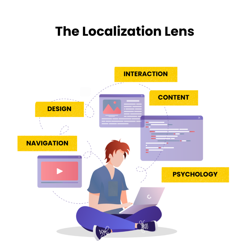
Language is just the surface layer. Underneath it sits more:
- Content– tone, phrasing, and what’s said (or left unsaid)
- Design– color, imagery, and visual hierarchy
- Navigation– how menus, filters, and structure map to local expectations
- Interaction– how forms, buttons, and flows behave
- Psychology– what builds trust, and what quietly erodes it
A user doesn’t read your interface line by line and grade it like an essay. They feel their way through it in seconds, and they decide almost instantly whether it was built with them in mind.
Why Brazil and Spanish-Speaking Markets Need Different UX Strategies
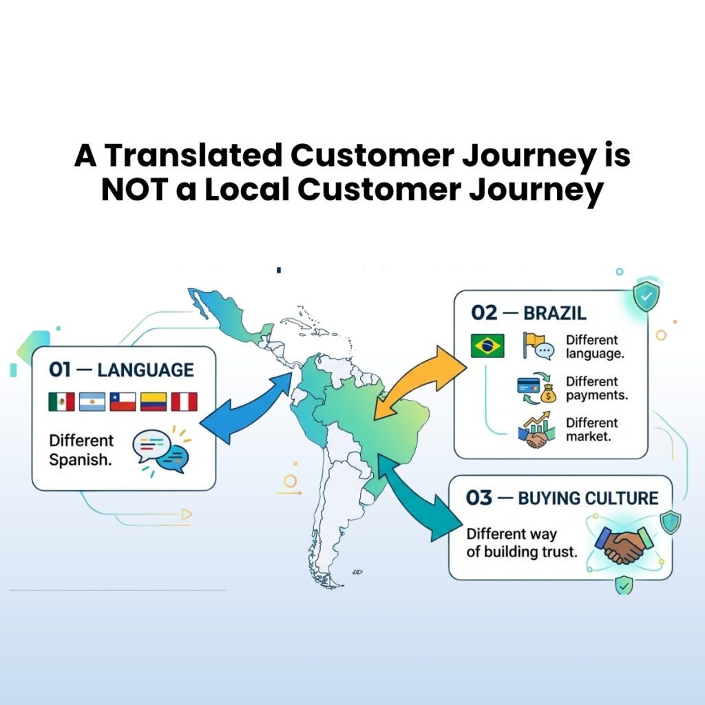
Latin America gets treated as one design brief far too often. It isn’t one. It’s a patchwork of markets with different languages, habits, and expectations, and your UX needs to know the difference.
Brazil Is Not Spanish-Speaking
Say it twice if you have to. Brazil speaks Portuguese, and that single fact reshapes far more than your copy deck.
Shopping habits differ. Regulations differ. And payment behavior differs enough that ignoring it can quietly wreck your conversion rate more on that shortly.
Spanish Differs Across Countries
A checkout form built for Mexico won’t automatically feel native in Argentina, Chile, Peru, or Colombia.
Formality shifts. Field labels shift. Even how people expect a form to be structured shifts by country.
A Peruvian user and a Mexican user may both read Spanish fluently and still feel like your product wasn’t built for them.
Culture Shapes UX
Colors carry meaning. Tone carries weight. Formality signals respect or its absence. Icons that read as obvious in the US can read as confusing, or even careless, somewhere else. Humor that lands in one country falls flat in another.
Global UX | Localized UX |
Generic | Familiar |
Universal | Context-aware |
Standard icons | Local expectations |
Default forms | Country-specific forms |
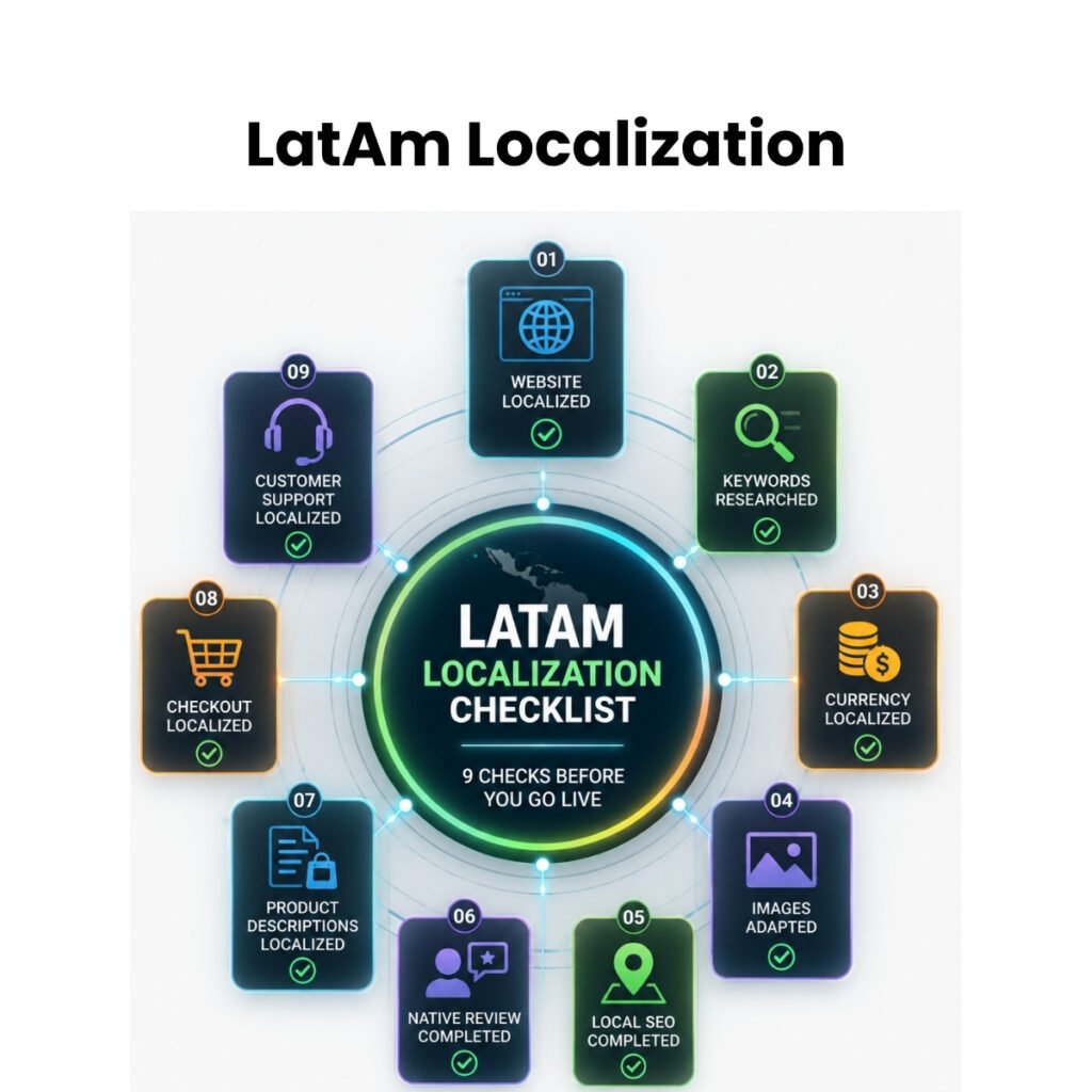
The Ultimate UX Localization Checklist
This is the part of the blog that should live on a sticky note, not just in a scroll-past section.
Each category below covers a spot where “technically correct” and “actually comfortable” quietly diverge. Skip one, and you get a user who leaves without telling you why.
Header | Description | Checks |
Language | Not just accuracy familiarity. The user expects vocabulary and tone from the brand that actually speaks their market. |
|
Navigation | The structure a user expects before they’ve consciously thought about it. If you get this wrong, then every click feels like a small negotiation. |
|
Forms | The single biggest source of quiet abandonment. A form built for one country’s ID or address system often can’t be completed at all elsewhere. |
|
Currency & Pricing | Money is emotional. A price that looks even slightly unfamiliar reads as untrustworthy before a user can explain why. |
|
Date & Time | A small mismatch here: the wrong date order or an unfamiliar time zone undermines confidence in everything else on the page. |
|
Visual Design | Photography, color, and icons carry meaning that don’t always travel. “Professional” in one market can read as “cold” in another. |
|
Content | Beyond the homepage; Product descriptions, FAQs, and support content need the same care, or the experience breaks the moment a user needs help. |
|
Checkout | Where localization either pays for itself or costs you the sale. Local payment methods are often the deciding factor, not a nice-to-have. |
|
Mobile UX | For much of Latin America, mobile isn’t a secondary experience, it’s the primary one. |
|
Accessibility | Often skipped, always noticed by the users it excludes. |
|
Master checklist:
Area | Completed |
Language | ☐ |
Navigation | ☐ |
Forms | ☐ |
Images | ☐ |
Currency | ☐ |
Dates | ☐ |
Checkout | ☐ |
Mobile | ☐ |
Accessibility | ☐ |
Ten areas. Ten places a user quietly decides whether your product was built for them or just delivered to them. Miss two or three, and the rest of the checklist won’t save you, that’s exactly where they’ll leave.
How to Build Your UX Localization Workflow
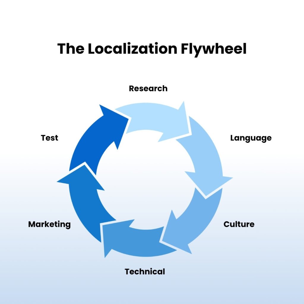
Here’s something worth sitting with. That checklist you just read isn’t a one-time form you fill out before a launch and then forget.
Localization only holds up when it’s built into how your team actually works, not treated as a final step before you ship.
Here’s what that looks like in practice, stage by stage:
- Research comes first, always. Before anyone touches a design file, someone needs to understand how people in this specific market actually behave, what they expect, what they distrust.
- Audience Analysis follows right after. This is where research turns into personas, patterns, and the specific quirks of a market, not just broad assumptions about “Latin American users.”
- Localization is where the checklist earns its keep. Language, forms, currency, visual design, all of it gets adapted here, using everything you learned in the first two stages.
- Design Review is the gut check. Someone who understands the target market looks at the work before it goes anywhere near a developer, and catches what a generic design pass would miss.
- Development builds it. This is also where those small technical details, like date formats and address fields, either get handled properly or get quietly ignored, depending on how much the earlier stages were actually respected.
- Testing puts real users in front of the product before launch, not after. This step alone catches most of the mistakes that would otherwise show up as silent churn.
- Launch happens only once the earlier six stages are actually done, not rushed.
- Optimization never really ends. Markets shift. So does slang, so do payment habits, so do expectations. What worked at launch needs another look six months in.
Here’s the flow, start to finish:
Research → Audience Analysis → Localization → Design Review → Development → Testing → Launch → Optimization
And here’s who typically owns each piece, so nothing falls through the cracks between teams:
Stage | Owner |
UX Research | Product Team |
Translation | Linguists |
Design | UX Designer |
QA | Localization Team |
Analytics | Marketing |
Notice something about that table. Localization touches almost every team you have. It’s not a project that belongs to marketing, or to design, or to engineering alone. The moment one of them treats it as someone else’s job, that’s usually where the gaps start.
Measuring Success
So how do you know if any of this actually worked?
You measure it the same way you’d measure any other part of your product, by watching what users actually do once they’re in front of it.
Here are the five numbers that matter most, and what each one is really telling you:
Metric | Why It Matters |
Bounce Rate | Tells you if the experience felt relevant within the first few seconds |
Conversion Rate | The clearest signal of whether localization is actually driving business results |
Time on Site | Shows whether users are engaging, or just passing through |
Form Completion | A direct read on how easy the experience actually was to use |
Cart Abandonment | Reveals checkout quality, and often, how much users trusted the process |
FAQ- UX LOCALIZATION
What is UX localization?
It’s the process of adapting an entire digital experience: design, navigation, forms, and content to match how users in a specific market think and behave, not just translating the on-screen text.
What is the difference between translation and UX localization?
Translation changes the words. UX localization changes the design, the forms, the payment options, and the overall feel of the product.
Why is UX localization important?
Because users judge trust within seconds, based on far more than language. A form that feels foreign gets abandoned even when every word is technically correct.
What should be localized on a website?
Language, navigation, forms, currency, dates, visual design, content, checkout, mobile experience, and accessibility.
How do you localize a website for Brazil?
Use Portuguese, not Spanish. Add PIX and Boleto as payment options. Localize forms, currency, and support to match Brazilian expectations.
How do you localize a website for Spanish-speaking markets?
Adjust vocabulary, tone, and formality by country. Mexico, Argentina, Chile, Peru, and Colombia each expect something slightly different.
What is cultural localization in UX?
Adapting colors, imagery, icons, tone, and formality so the product feels familiar rather than imported.
Can AI localize user experiences?
AI can speed up parts of the process, but cultural nuance and local user testing still need human judgment.
Signing Off
Design isn’t universal, no matter how clean or modern it looks on your own screen.
Users don’t compare your product with competitors from another country. They compare it with every digital experience they already trust in their own market: their bank’s app, their favorite delivery service, the checkout they use every week without thinking about it.
The closer your UX feels to home, the higher the odds they’ll stay, engage, and convert.